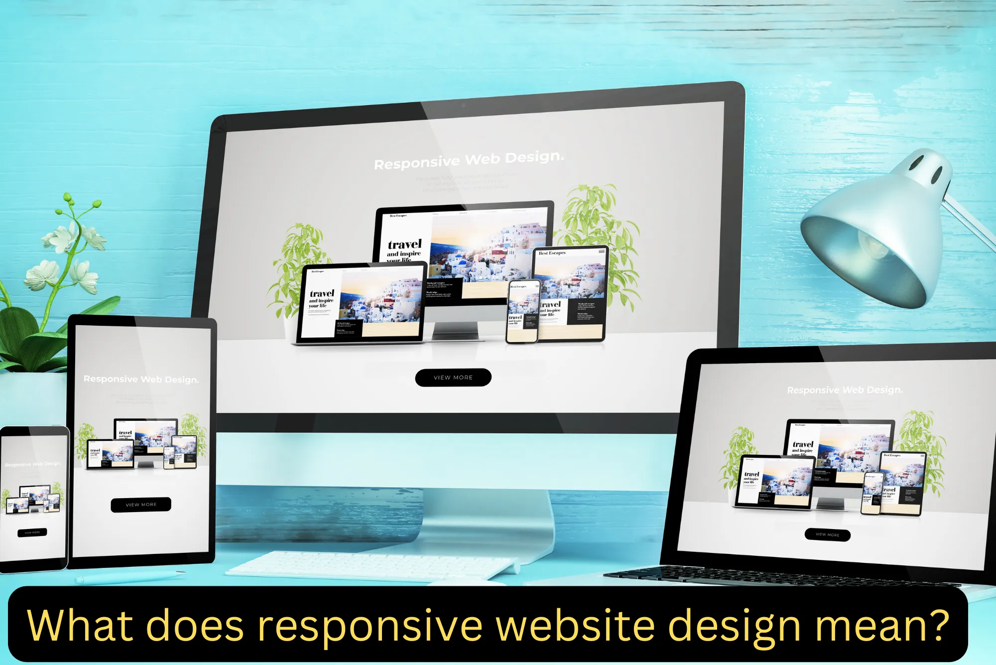
Responsive website design refers to a design approach that aims to create websites that provide an optimal viewing and interaction experience across a wide range of devices and screen sizes. In essence, a responsive website dynamically adjusts its layout, content, and functionality based on the device’s screen size, orientation, and capabilities, ensuring that users can access and navigate the website seamlessly on any device, including desktops, laptops, tablets, and smartphones.
Key characteristics of responsive website design include:
Flexible Grid Layouts: Responsive websites use fluid grid systems that enable content to resize and reposition based on the available screen space. This ensures that content remains readable and accessible across different devices and screen sizes.
Media Queries: Media queries are CSS rules that allow developers to apply different styles to a website based on factors such as screen width, resolution, and device orientation. By using media queries, responsive websites can adapt their design and layout to accommodate different devices and screen sizes.
Flexible Images and Media: Responsive websites use techniques such as fluid images and media to ensure that visual content scales proportionally to fit the screen size. This prevents images from being cropped or distorted on smaller screens and maintains image quality across devices.
Viewport Meta Tag: The viewport meta tag allows developers to control the viewport’s behavior and scale on mobile devices. By specifying the viewport width and initial scale, developers can ensure that the website displays correctly and is fully visible on mobile screens.
Responsive Navigation: Responsive websites often feature collapsible or adaptive navigation menus that adjust based on the device’s screen size. This ensures that users can easily navigate the website regardless of the device they are using.
Touch-Friendly Interactions: Responsive websites incorporate touch-friendly design elements and interactions to enhance the user experience on touchscreen devices such as smartphones and tablets. This includes larger buttons, swipe gestures, and optimized form inputs.
Overall, responsive website design prioritizes user experience and accessibility by ensuring that websites are visually appealing, functional, and easy to use across different devices and screen sizes. By adopting responsive design principles, businesses can reach a broader audience, improve engagement, and enhance the overall effectiveness of their online presence. Hire our services to get responsive website design services in Dubai.


